Archive
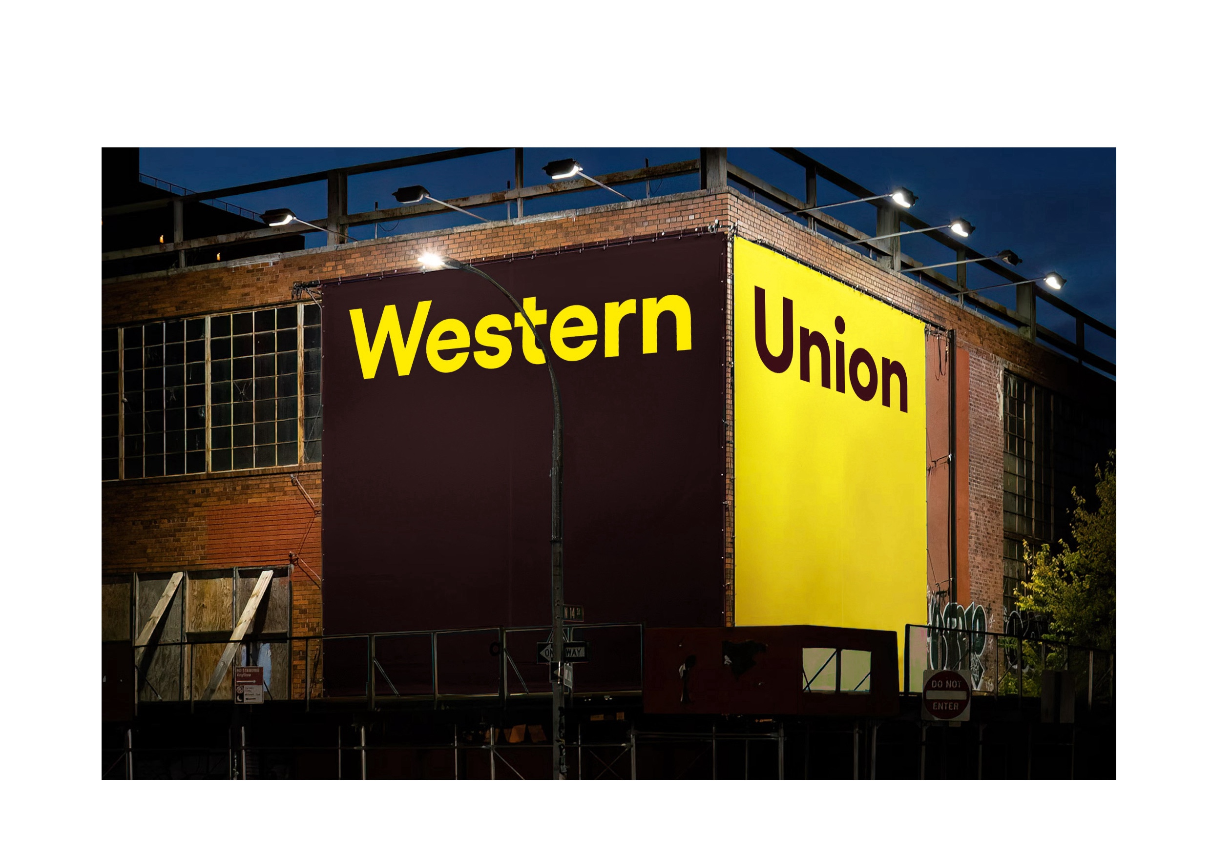
In this project, I reidesigned Western Union’s brand visual language, transforming its identity into a more modern and refined expression. The iconic logo was streamlined into a cleaner, simpler form, retaining its bold yellow as the primary color while introducing dark brown and a palette of soft, complementary hues to create a harmonious and balanced visual identity.
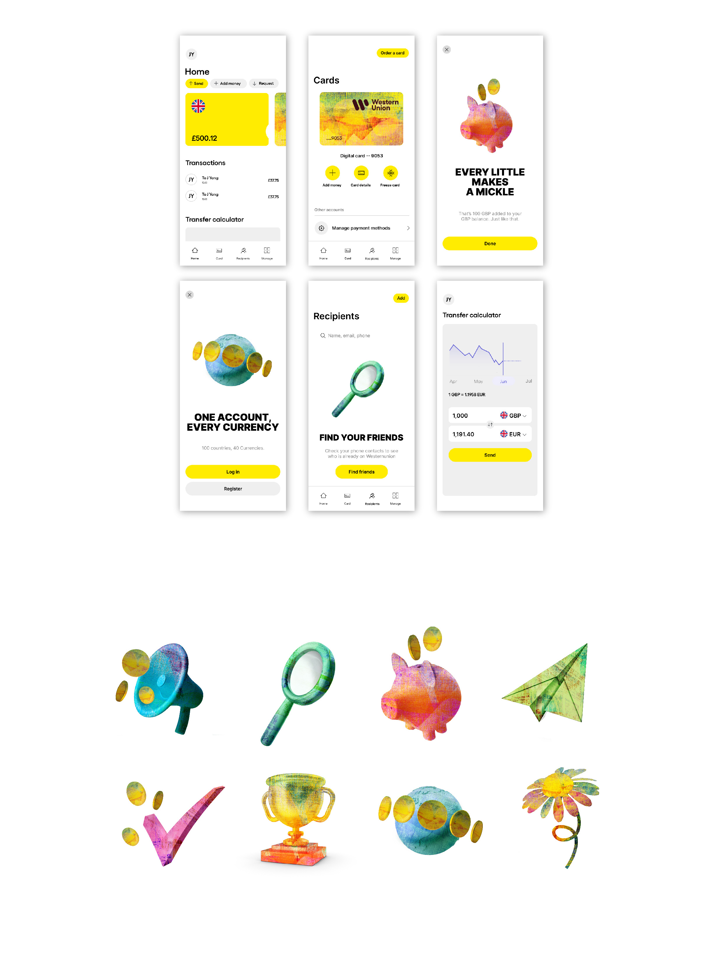
At its core, Western Union is dedicated to connecting people across borders through seamless transfer and payment services. To reflect this global mission, I crafted a unique design language by weaving and layering landscapes from around the world into intricate patterns.
These patterns not only symbolize the brand’s worldwide reach but also serve as dynamic textures for 3D graphics, bringing a fresh, immersive experience to mobile interfaces.
The result is a brand that feels both contemporary and deeply connected to its purpose of uniting people and cultures.